"When Club de Hockey Canadien was founded for the 1909/10 season, the uniform consisted of a navy blue sweater with white narrow bands at the shoulders connected to a band across the chest. The center of the chest band had a white "C" on it. ...
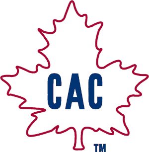
When the team was sold the following year, it was renamed Club Athletique Canadien. The sweater is now red with a green Maple Leaf in the center bearing a gothic "C" in its center. The uniform was changed once again for the 1911/12 season. The Maple Leaf on the sweater remained, but the sweater now had blue, white, and red stripes. The "C" was replaced with "CAC". T he Canadiens uniform was redesigned for the 1914/15 season. It had a similar design to today's road uniform. The center crest had a "CA" instead of the famous "CH". The team reverted back to Club de Hockey Canadien for the 1916/17 season.
The crest was now a big "C" and inside a smaller "H", to represent "Club de Hockey Canadien". Other minor alterations have taken place over time, but the traditional "CHC" has remained.

2 Comments:
I found this on some site not worth attributing:
"When Club de Hockey Canadien was founded for the 1909/10 season, the uniform consisted of a navy blue sweater with white narrow bands at the shoulders connected to a band across the chest. The center of the chest band had a white "C" on it. ...
When the team was sold the following year, it was renamed Club Athletique Canadien. The sweater is now red with a green Maple Leaf in the center bearing a gothic "C" in its center. The uniform was changed once again for
the 1911/12 season. The Maple Leaf on the sweater remained, but the
sweater now had blue, white, and red stripes. The "C" was replaced with "CAC".
T
he Canadiens uniform was redesigned for the 1914/15 season. It had a similar design to today's road uniform. The center crest had a "CA" instead of the famous "CH".
The team reverted back to Club de Hockey Canadien for the 1916/17 season.
The crest was now a big "C" and inside a smaller "H", to represent "Club de Hockey Canadien". Other minor alterations have taken place over time, but the traditional "CHC" has remained.
I always figured the "H" {in the current logo) stood for "Habitants." This blog is so informational.
Post a Comment
<< Home